
LOCAL/
19:43:40
19:43:40
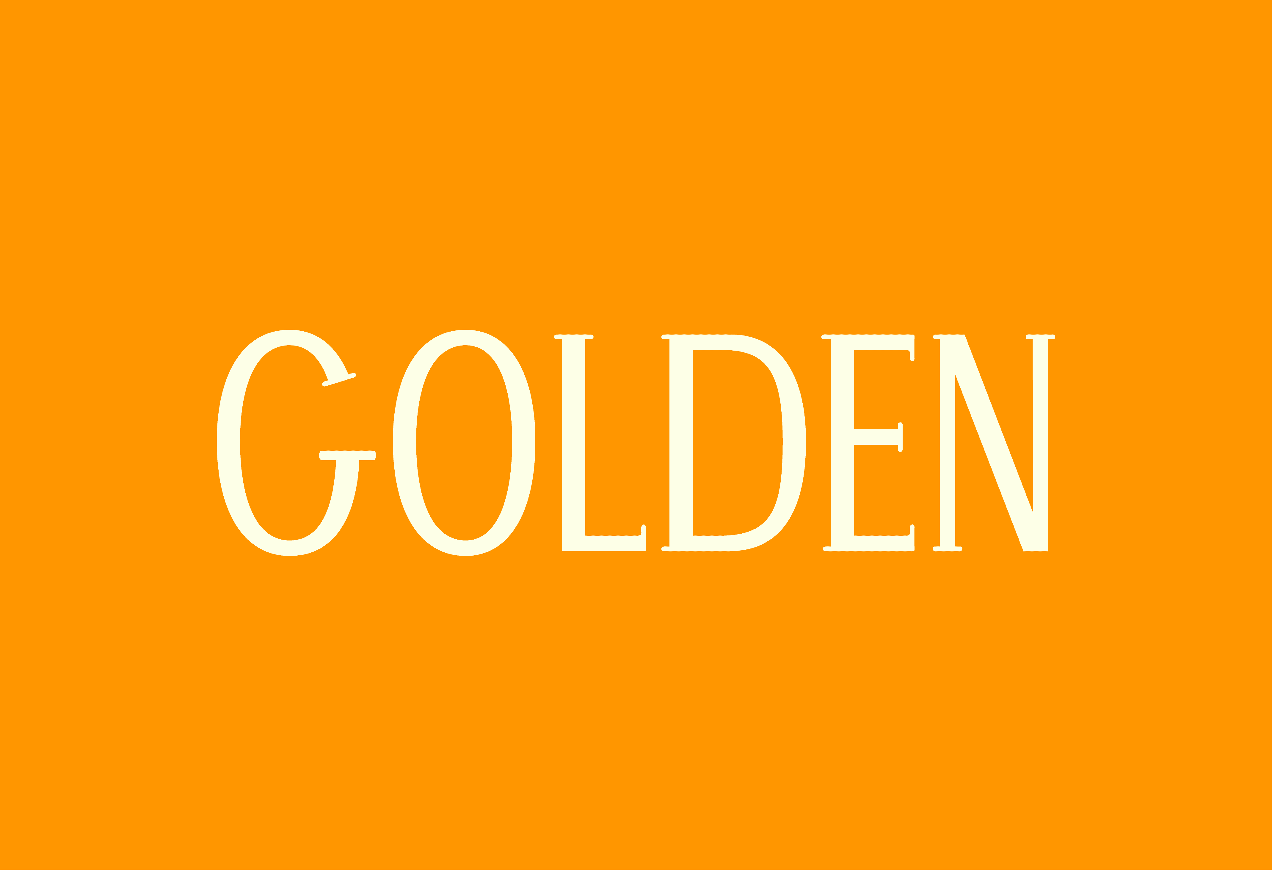
Golden Uppercase Typeface
Golden Uppercase Typeface
Golden: an uppercase serif typeface inspired by the free-spirited essence of summer, featuring thin, graceful letterforms that evoke the lightness and warmth of sunny days
Client
University of Kansas
University of Kansas
Year
Year
Spring 2025
Spring 2025
Industry
Industry
Typeface Design
Typeface Design
Research
Research
The development of Golden began with studying letter proportions and how different typefaces vary in width. This research informed the overall balance and structure of the typeface. Analyzing these relationships helped establish a foundation for the design process.
The development of Golden began with studying letter proportions and how different typefaces vary in width. This research informed the overall balance and structure of the typeface. Analyzing these relationships helped establish a foundation for the design process.
Research
The development of Golden began with studying letter proportions and how different typefaces vary in width. This research informed the overall balance and structure of the typeface. Analyzing these relationships helped establish a foundation for the design process.
Design
Design
The design phase focused on incorporating rounded serifs and distinctive curves to create a modern yet timeless feel. Key letters like H, O, and E were developed to establish consistent stroke thicknesses and curves. These elements formed the foundation for the typeface’s character and unique personality.
The design phase focused on incorporating rounded serifs and distinctive curves to create a modern yet timeless feel. Key letters like H, O, and E were developed to establish consistent stroke thicknesses and curves. These elements formed the foundation for the typeface’s character and unique personality.
Design
The design phase focused on incorporating rounded serifs and distinctive curves to create a modern yet timeless feel. Key letters like H, O, and E were developed to establish consistent stroke thicknesses and curves. These elements formed the foundation for the typeface’s character and unique personality.
Development
Development
Using Glyphs, the character set was expanded, refining previously created elements for cohesion. The most challenging part was adjusting curved letters like S, C, and G to align with the overall design. The final result was a harmonious typeface with smooth transitions and a distinct personality.
Using Glyphs, the character set was expanded, refining previously created elements for cohesion. The most challenging part was adjusting curved letters like S, C, and G to align with the overall design. The final result was a harmonious typeface with smooth transitions and a distinct personality.
Development
Using Glyphs, the character set was expanded, refining previously created elements for cohesion. The most challenging part was adjusting curved letters like S, C, and G to align with the overall design. The final result was a harmonious typeface with smooth transitions and a distinct personality.


More Work
More Work

Wicked Lizards Baseball Team
Branding
2025
2025
Wicked Lizards Baseball Team
Branding
2025
2025
Wicked Lizards Baseball Team
Branding
2025
2025
Wicked Lizards Baseball Team
Branding
2025
2025

Focus Energy Drink
Branding
2024
2024
Focus Energy Drink
Branding
2024
2024
Focus Energy Drink
Branding
2024
2024
Focus Energy Drink
Branding
2024
2024
©2025 Morgan Botts. All Rights Reserved.
©2025 Morgan Botts. All Rights Reserved.
©2025 Morgan Botts. All Rights Reserved.
©2025 Morgan Botts. All Rights Reserved.